


The new Young V&A reimagines the former ‘Museum of Childhood’ as a joyous celebration of design and creativity, writes Ben Flatman
The idea of a “Museum of Childhood” has always struck me as faintly sinister – the sort of Victorian institution you could imagine cropping up in a Tim Burton film, quite possibly stocked with live specimens. It is a relief therefore that, as part of a £13m reimagining of its original east London outpost, the V&A has not only extensively refurbished its historic building, but also ditched the old name and rebranded the museum as the “Young V&A”.
What has not changed is the location. Young V&A still occupies the rather foreboding structure that was transposed to Bethnal Green from Albertopolis in 1872. I first visited this cavernous building as a child in the 1980s, and I remember thinking even then that it was a somewhat austere setting for a museum supposedly dedicated to childhood.
The question of what the place was actually for also seemed to hang in the background. Philippa Simpson, the V&A’s director of design, estate and public programme, acknowledges that it in its previous incarnation, it was “very much a museum for parents and carers to enjoy a trip down memory lane”. This conception of the museum as a collection of toys and childhood-related bric-a-brac has not been ditched entirely, but it has undergone a major rethink.
Young V&A is now much more aligned with the V&A’s core themes of art, design and performance, with an emphasis on “innovative making and ingenuity”. Working closely with young stakeholders as co-designers, architects De Matos Ryan and AOC have subtly remodelled most of the key spaces in the building. And the galleries themselves have been completely reimagined, with interaction and creativity brought to the foreground.
Simpson describes the museum’s mission as now being to “generate the next generation of designers and makers”.
The project started eight years ago, led by the V&A’s in house curatorial team. De Matos Ryan were appointed in 2018 to work on the fabric and organisation of the building. Design workshops began before covid-19, with the operational museum used as a testing ground for new ideas. “It’s all grounded in child psychology and how we learn,” says Simpson.
De Matos Ryan has sought to improve the visual links within the building
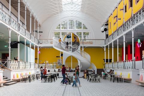
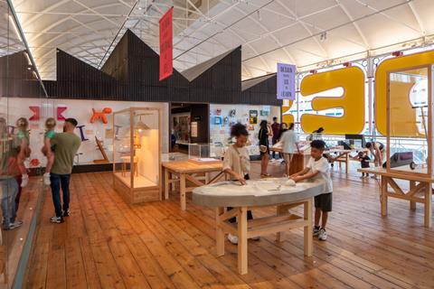
Architecturally, one of the key moves has been to largely declutter the central section of the building and reimagine it as a public “town square” with a grand new “kaleidoscope” staircase at the east end. The fabric of the building has also been restored, with the mosaic floor, laid by female prisoners in the 19th century, patched and repaired.
Great lengths have also been taken to conceal services and allow the Victorian cast-iron structure to breathe freely. And quite extreme temperature differentials between the different levels of the building have been addressed through a new ventilation strategy.
De Matos Ryan has sought to improve the visual links within the building. Caruso St John’s sombre 2006 entrance extension is retained, but there are new glass sliding doors leading from the shop (formerly a temporary exhibition space) into the galleries.
The intention is that you see straight into the main space on arrival. Low-level windows have also been punched through from the central courtyard to the ancillary spaces below to create visual connections.
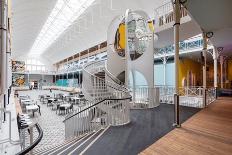
The new central staircase provides a visual focus and hovers above the relocated café. José De Matos says the practice had toyed with installing a helter-skelter here, but their young co-designers pushed them towards a different approach.
Although De Matos describes the Victorian building as “very flexible”, its exhibition hall qualities also provided clear constraints. It is a hard space to subdivide without coming into direct conflict with the existing architecture. Mostly the new insertions work well but, in places, this tension between open plan and the need to enclose space is less successful.
The rooflights that run the full length of this space were previously painted over but have now been opened up to flood the ground floor with light. As Simpson points out, “bringing natural light into a museum is not optimum”. In response, AOC, acting as gallery designers, have added a whole new layer to the building, with a series of pavilions within the larger structure.
AOC arrived later into the project and were selected because they “didn’t come with a scheme or a sketch”, says Simpson. “We weren’t specifically looking for a museum architect – we’re the museum experts.”
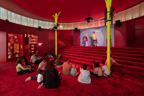
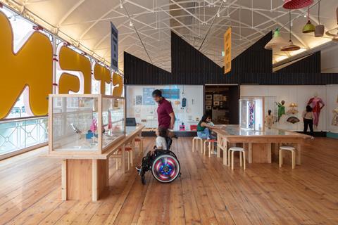
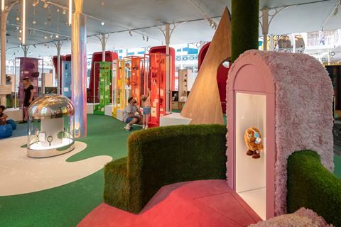
On the north side of the museum, one of the existing staircases has been closed off and the space transformed into what feels like the plush lobby of a West End theatre. Thick dark red carpet covers the floor of a circular enclosure that contains theatre exhibits and doubles as a performance space. A quirky selection of objects in the display cases facilitate storytelling, while the remnants of the stairs hint at an imagined world beyond this room, and nicely fuel the imagination and sense of drama.
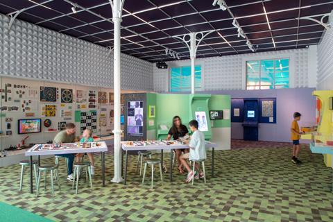
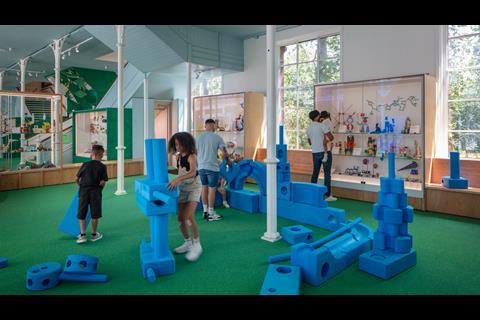
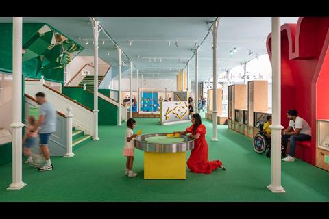
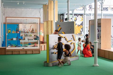
Carpet has been used extensively in the galleries, helping to counteract the building’s previously poor acoustics. Gill Lambert of AOC says there was a desire to “to build in softness to the museum” and an aspiration to get “kids to get down on the floor” to view and interact with the museum in new ways. This has also been achieved through bespoke soft seating, which in places resembles a “found” assortment of padded boxes and old footstools.
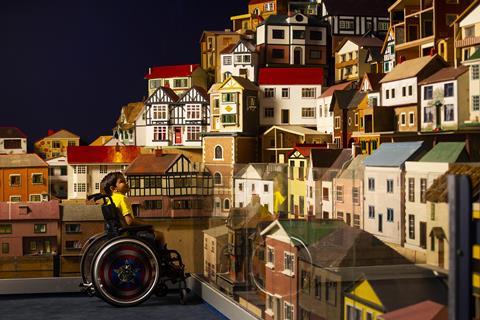
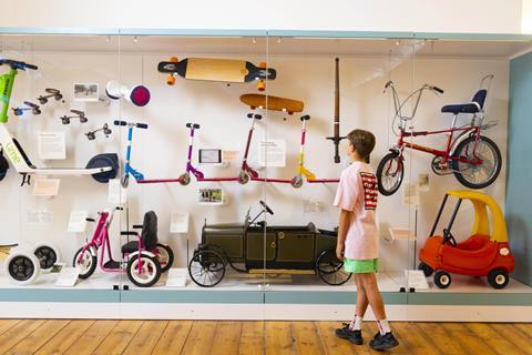
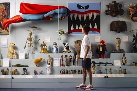
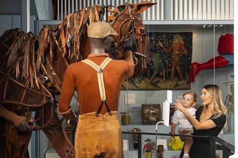
Key parts of the old collection have been retained and remain central to the new museum’s approach. The old dolls’ houses are still there, but they have been subtly interwoven with an architecture and urbanism subtext, with a Ron Herron Walking City drawing hanging nearby. Simpson describes the gallery as being “activated as a street”.
A key desire for Lambert, was that the museum should give young people a sense of “agency”. The spaces have been conceived around specific age groups and Simpson expresses a hope that visitors will “grow” through the spaces over successive visits.
A firm favourite among the new galleries is likely to be one room with a sloping floor that allows for some enjoyably Alice in Wonderland-like optical illusions. In another corner of the ground floor sits a darker space, aimed at older children, that focuses on games and even has a Minecraft version of the museum to explore.
The general absence of audiovisual stimuli is notable, and Simpson says they started the design process from the basis of having “no screens”. Taking an additive approach, they then introduced screens where it was felt they were essential to the theme of the exhibit.
The ground floor southern galleries have been transformed by the removal of blinds and the reintroduction of direct views from the museum out into Museum Gardens. Simpson says this was driven by a desire for the museum to feel “connected back to Bethnal Green”.
Ascending the remaining original staircase on the north side of the museum, visitors now arrive in another one of AOC’s pavilion insertions. This one is titled “The Factory” and is constructed from softwood with a corrugated hempcrete cladding.
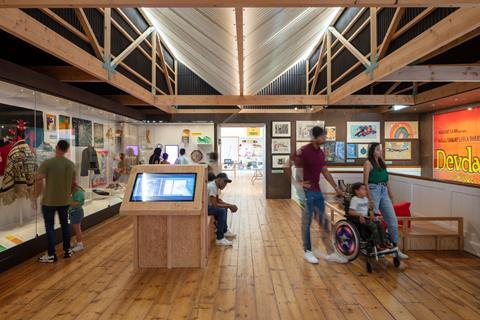
The stripped back industrial shed aesthetic has a Japanese quality and signals a transition to a calmer, and perhaps more serious tone. A nearby display includes a scale model of Goldsmith Street by Mikhail Riches.
Also on the first floor is an enclosed studio for a resident designer. The space is already partially occupied by fashion accessories-designer Clara Chu, who works with found and everyday materials. The energy induced by having a designer and maker on site is intended to reinforce the sense that this reinvented museum is here to inspire creativity.
The constraints of the existing building are also evident on this floor. The new temporary exhibitions space sits rather awkwardly on the north side of the museum. And a new service lift in the north-east corner of the building, feels like an afterthought.
In the south-east corner an existing staircase obscures much of the grand east window that it sits in front of. But these are minor quibbles, and perhaps reflect the limited budget and the need to work with expensive existing infrastructure (with embedded carbon costs) where possible.
The brief – set by the project’s young co-designers – was to create “the most joyful museum in the world”. Lambert describes a design process which included the use of graphic novels and speech bubble Post-its to help the children articulate what that meant.
Lambert has spoken previously about how “joy” for her practice is often expressed through “colour, pattern and tactility”, which she has again explored here, with an approach that invites physical interaction, as much as looking.
Simpson says the process led the team to a definition of joy that incorporates “informality” and a sense of a “safe space”, where young people can produce prototypes and fail, within a context where “no idea is a bad idea”.
This is certainly not the museum I remember from my childhood. De Matos Ryan and AOC have brought out the playful potential of this building, while adding an underlying seriousness of purpose around what the institution is actually here for.
For those who still take great pleasure from a display case full of curiosities or beautiful objects, this place still resonates. And the addition of a more interactive and creative dimension adds, rather than detracts, from that experience.
“We didn’t find a good blueprint for this,” says De Matos, of how to design a contemporary design museum for children. With the new Young V&A, perhaps there is one now.
>> Also read: Not in front of the children


No comments yet