


Britain’s most establishment art gallery has reinvented itself as a palace of inclusion. Is it a success?
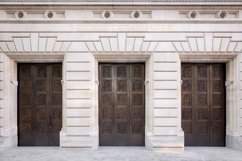
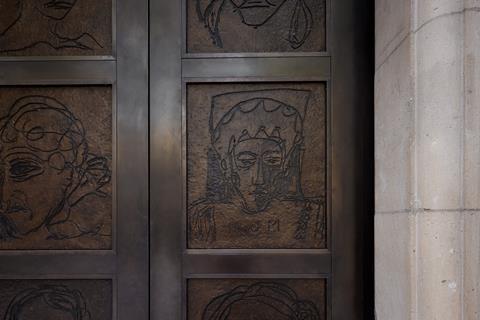
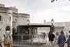
A set of three towering bronze doors greets you as you walk up to the new front entrance of the transformed National Portrait Gallery. On these newly commissioned portals are etched 45 portraits drawn by the artist Tracey Emin. Representing women of all ages and ethnicities, they are intended to counterbalance the line-up of men depicted on roundels above the first-floor windows.
As you enter the building, you are faced with a line-up of marble busts. Front and centre are a sculpture of Nelson Mandela by Ian Homer Walters and Reaching Out by Thomas J Price, depicting an unnamed Black woman holding a mobile phone. On the wall on the right-hand side are some lines of text describing this 167-year-old institution as a “gallery of people, for people”.
The message is clear: this gallery, which has always been – and still is – dominated by pictures of rich white men, is now a gallery for everyone. The tone set by that entrance hall is a reminder of how the art world has been transformed over the past five years by a heightened awareness of the need to represent diversity. Yes, Britain’s most establishment art gallery has “gone woke” – and it’s long overdue.
This requirement was in the first line of the brief handed to the project’s lead architect Jamie Fobert Architects and restoration architect Purcell: “To enhance the identity, profile and physical presence of the National Portrait Gallery, making the building accessible and welcoming to the widest and most diverse audience.”
This has been the driving force behind the restoration, the most significant in the history of the gallery since it moved to its current grade I-listed home, a neoclassical building tucked behind the National Gallery, in 1896.
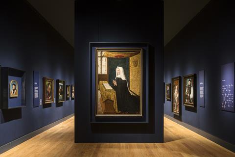
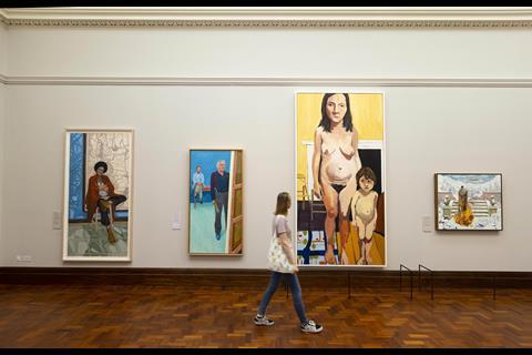
Diversity is everywhere, from the books on sale in the new shop to an impressive 7ft high portrait of the first Polynesian man to visit Britain which hangs in the prime spot in the gallery’s 18th-century room. Painted in 1774, the Portrait of Mai – it was originally called the Portrait of Omai but has been renamed to reflect the subject’s real name – was jointly purchased by the gallery and the J Paul Getty Museum in Los Angeles in April this year.
The gallery’s collection has undergone a “complete rehang”, according to its director Nicholas Cullinan. The building is also now fully accessible to wheelchair users; previously they had to use a back-of-house entrance.
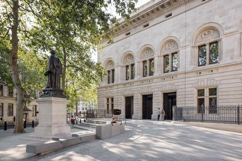
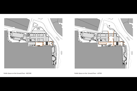
“It was a building that was very much keeping you at bay, keeping you out,” Cullinan admits. The addition of a new main entrance – the original entrance will still be used, a request from Historic England – has given the ground floor approximately double the public space it had before, with accessibility and inclusivity informing every design choice.
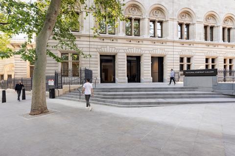
Fobert says the project was primarily driven by the “desire for the gallery to turn to face the city, to open up to the public in a way the original building did not”.
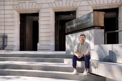
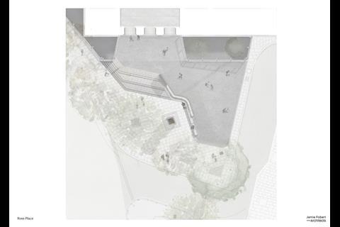
The grand new front entrance faces onto a triangle of public realm on the Charing Cross Road and makes the original entrance look like a pokey back door. A sweeping staircase leads up to a wide portal that has been punched through what had previously been three ground-floor windows.
Load-bearing walls nearly a metre thick had to be removed from inside the building to open up the new entrance hall. These were replaced by a series of steel box frames designed by structural and civil engineers Price & Myers, with each pair weighing 6.5 tonnes and supporting 200 tonnes of grade I-listed building fabric.
It took seven weeks to tighten 2,600 bolts to fit the sections of steel that had been carefully manoeuvred into the space. Hydraulic jacks were inserted to transfer the building’s weight onto the frames from temporary supports.
Each jack applied 165 tonnes to each pair of beams, deflecting them by 23mm before packing up to the existing masonry. “It was a nerve-wracking experience for a structural engineer to watch, and a good workout for the man operating the hydraulic jack,” Price & Myers said.
The result is a broad, airy space which gives views from the street directly into the heart of the building. On the left as you walk in is the new shop, designed by Alex Cochrane Architects.
Similarly airy, it makes good use of the building’s tall portland stone arches which provide multiple entrances from both the main hall and the ornamental Victorian staircase leading from the original entrance. “Everything we’ve done around circulation is about giving people choice,” says Fobert.
These shapes are repeated in groups of arched shelves which line the walls, rising nearly to ceiling height but “stopping respectfully short of the period architectural detailing” according to Alex Cochrane. Lining the inside of the shelves are thin “halos” of light used both to illuminate the products on sale and to catch the eye of passers-by on the street outside.
This is now possible because the black paint which has covered the windows since the 1940s has been removed. First done during the Second World War as part of black-out procedures designed to confuse enemy aircraft, the windows were kept in this condition to provide more wall space.
Cochrane says they were finally restored to their original state so the shop could be filled with light, despite the resulting loss of retail space.
Heading out through the original entrance hall brings you to the refurbushed and extended ground-floor cafe. The ground floor of this part of the building, the East Wing, now known as the Weston Wing, had been reconfigured over many years and installed with a raised floor.
It had been assumed that no original fabric remained under this floor, so it was a surprise when, one morning, main contractor Gilbert Ash lifted some old carpet tiles to reveal a small section of red terrazzo. It was discovered that this extended across the wing’s two main floors, although damaged in places by a series of trenches gouged out in the 1960s to carry electrical cables.
These bits have been repaired and are now almost invisible. In other parts of the floor where the original terrazzo had been lost completely, Fobert filled in the gaps with pieces of Rosso Levanto marble, a type used extensively in baroque churches in Rome.
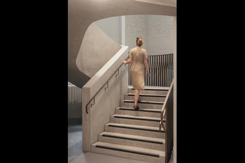
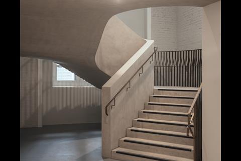
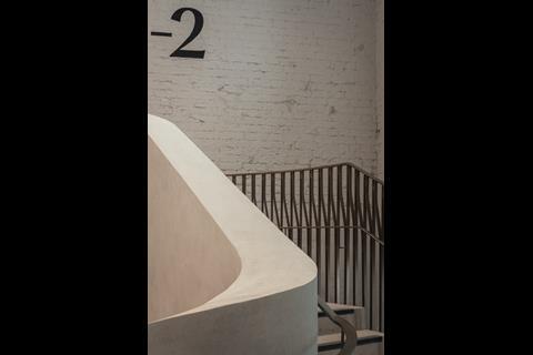
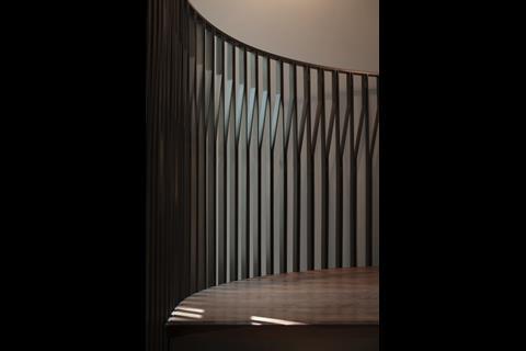
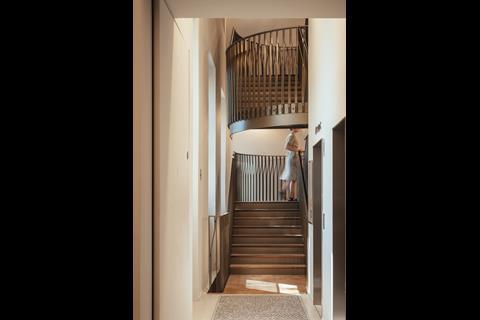
The gallery’s greatly expanded learning centre is accessed by a new spiralling concrete stair leading to the basement. Here there had originally been a double-height courtyard sunk beneath the street level, but the lower level had been infilled in the 1980s to provide storage space. Fobert’s design removed these later additions and restored the courtyard to its original proportions.
Next to this space is the only new-build element in the gallery’s entire refurbishment, a glazed double-height space built underneath the bridge leading into the new main entrance. Original engineering brick vaults and granite facades which had been damaged by the 1980s building work were also restored by Purcell.
The new learning spaces, which are nearly four times bigger than they were before the refurbishment, will be used for a range of educational programmes for schools, families, community groups and adult learners.
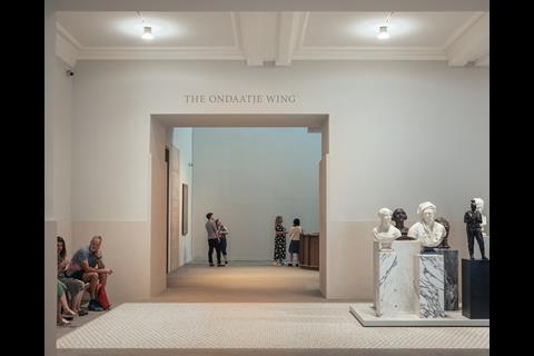
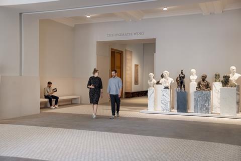
Back up stairs, the building’s central hall has also been given a refresh. The Ondaatje Wing was designed in 1999 by Dixon Jones Architects, filling in a service courtyard which existed between the National Portrait Gallery and the National Gallery. Fobert has installed a new ground-floor gallery (the not very catchily named National Lottery Heritage Fund Gallery), where many of the newest acquisitions and commissions will be exhibited.
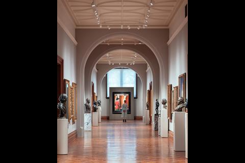
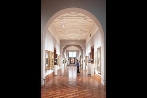
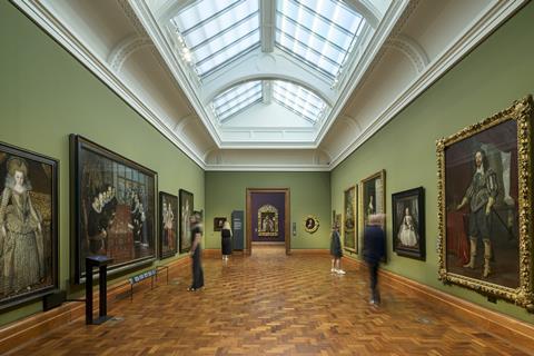
There is also a new welcome desk and a new wall cloaking Dixon Jones’ escalator leading up to the upper storey galleries, which have seen a complete restoration.
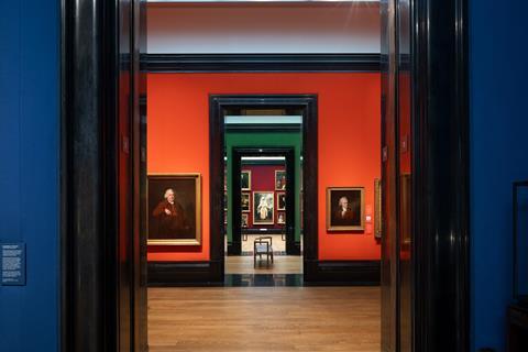
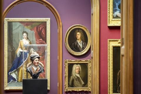
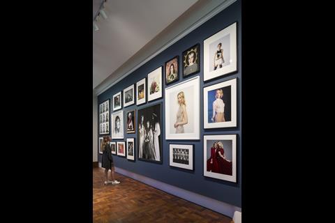
The most striking intervention in these galleries is a bold new colour scheme. While the ceilings have been unified with a single pale coloured paint, the walls are hung with an expensive-looking woollen fabric in a cascading series of blues, purples and reds.
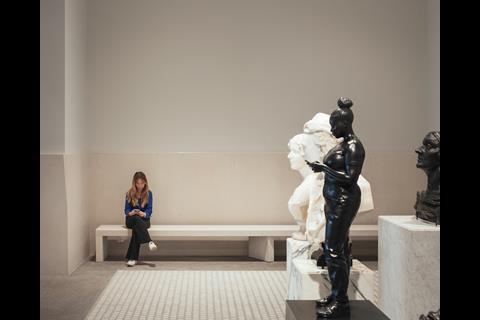
The original teak architraves lining the arched doorways which separate these rooms have been removed by Purcell and extensively oiled to “make them sing”. New display cases and wood benches designed by Fobert also grace the gallery rooms.
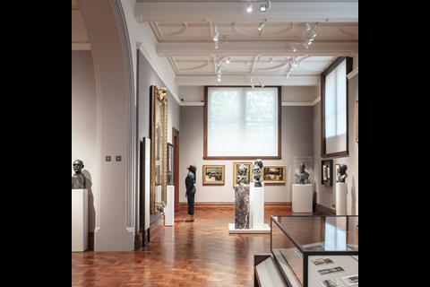
In one gallery on the ground floor, containing contemporary portraits including a large painting of Judi Dench, is a protruding section of wall. Behind this is the building’s service hub for the new ventilation system, which threads ducts throughout the building in a tree branch arrangement using displacement ventilation.
This neatly hidden service unit has avoided the need for ceiling or floor voids, allowing the building’s historic features to be on full display. The lighting of the galleries, which used to hang at the centre of each room at cornice level, has also been lifted by engineers Max Fordham into the lanterns so it almost disappears from view.
By this point the press tour to which Building Design was invited has somewhat dispersed as people become distracted by the portraits on display. It is clear that Fobert, Purcell and the rest of the project team have done a thorough job – “highly successful” says the gallery’s impressed-looking former director Charles Saumarez Smith.
It also feels inevitable that it will become part of this summer’s essential London day-trip. The press visit was just five days before opening day and there still seemed to be a huge amount of work to be done. Piles of building materials cluttered several rooms, hoardings were still up across the building and the descriptions for most pictures were still printed on bits of paper taped to the wall.
But these were last-minute niggles duly smoothed in time. The real measure of the refurbishment’s success will be whether the gallery can fulfil its stated aim – of attracting a diversity of visitors that reflects the city that it wants to represent. I see no reason why it should not.
Downloads
1. National Portrait Gallery_New Lower Basement Plan (c)Jamie Fobert Architects
PDF, Size 0.17 mb2. National Portrait Gallery_New Upper Basement Plan (c)Jamie Fobert Architects
PDF, Size 0.3 mb3. National Portrait Gallery_New Ground Floor Plan (c)Jamie Fobert Architects
PDF, Size 0.41 mb4. National Portrait Gallery_New First Floor Plan (c)Jamie Fobert Architects
PDF, Size 0.33 mb5. National Portrait Gallery_New Second Floor Plan (c)Jamie Fobert Architects
PDF, Size 0.14 mbNational Portrait Gallery_2_Section (c)Jamie Fobert Architects
PDF, Size 0.55 mbNational Portrait Gallery_6_Weston Wing Section (c)Jamie Fobert Architects
PDF, Size 0.62 mbNational Portrait Gallery_7_Weston Wing Terrazzo (c)Jamie Fobert Architects
PDF, Size 0.97 mbNational Portrait Gallery_10_The Mildred and Simon Palley Learning Centre (c)Jamie Fobert Architects
PDF, Size 1.73 mb
Postscript
The National Portrait Gallery reopened to the public on Thursday, 22 June.


No comments yet