


Gillian Darley on the delight of a well-crafted detail

I wonder if visual considerations are allotted enough weight on the balance sheet measuring social value?

I would argue for the importance of the pleasure given by fine materials, well used. The tonal elements given by, for example, copper as it weathers to green or Corten as it gingers down, the textural delights of shuttered or bush-hammered concrete, or the sheen and colours of fine ceramic tiles are all positive contributions to the built scene, bearing in their different ways marks of skill and close attention. Without coming over too John Ruskin, for there are machines in the room here, there is something of craftsmanship in all this.
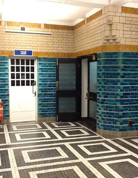
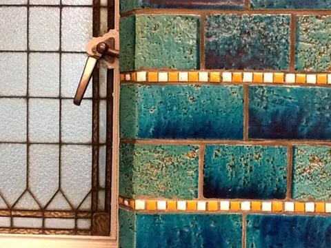
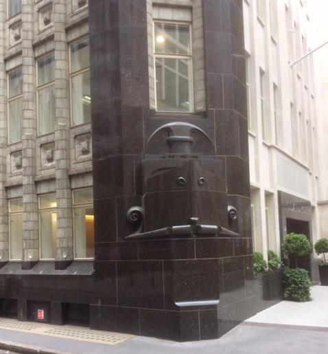
Back in 1916, when Hendrik Petrus Berlage designed and built his consummately beautiful office block for the Dutch shipping line, Holland House in the City of London, he indulged in a flurry of ceramics; a musty green on the exterior, luminous, de Morganesque turquoise on the interior and, for the very observant, the corner detail of a shiny black prow to give the clue to what the company was up to, turning the corner on to Bury Street. The City streets could do with such beauty in the wartime atmosphere – even provided by a neutral neighbour, the Netherlands.
Certainly, if the purpose of decoration is to brighten the built landscape and the mood of the passer-by then the current rash of off-the-peg coloured cladding panels looks like the cynical ploy it is: a sterile application of visual band-aid. It will take more than that to erase our memory of the grim footage of recent, even repeated, events as flames leap with destructive abandon over the garish, melting, surfaces.
But where the good intentions of client and artist and/or designer are united, the picture changes. The current small exhibition, Hand Held to Super Scale: Building with Ceramics (not perhaps the catchiest of titles?) at London’s Building Centre covers a wide range of applied ceramics, from the hand-made to the manufactured. Sometimes the two collide. It includes Assemble’s locally made tiles from their Turner Prize-winning Liverpool project and the ebullient collection of highly figurative cladding tiles applied to Grayson Perry and Charles Holland’s (for FAT) A House for Essex. In a recent lecture there, Perry and Holland explained their thinking, from the fanciful clues to the artist’s fictional Essex everywoman Julie – all resonant motifs (among them seaxes, nappy pins, wheels of life and fecund figures) – to the difficulties of keeping the clay moulds consistently damp before firing in order to retain the accuracy of the measurements on the elevations.
Elsewhere ceramics can help to illustrate the structure, much as Richard Deacon’s entablature and window embrasures do on Eric Parry Architects’ block, turning key aspects of a polite Piccadilly frontage into a genteel riot of colour and detail.
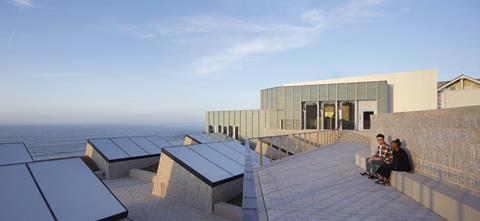
Equally, carefully chosen but essentially simple glazed finishes can work wonders at setting a building within its landscape. The most memorable element in the exterior view of the remodelled Tate St Ives is its roofscape, where Jamie Fobert Architects has applied a subtle, subdued, aqueous coloured ceramic cladding to the spare new elements. On a recent visit, on a gentle, grey day, the material acted like a tonal mirror to the quietly swelling sea in view far beyond.
The aesthetic arguments in the exhibition on Store Street are persuasive, but heaven forfend that cheap-and-cheerful ceramic tiling becomes a default cladding material – the avocado bathroom suite of its time – and land up in the wrong hands.


No comments yet