


The institute is preparing to roll out a redesigned visual identity and digital platform as part of its House of Architecture programme
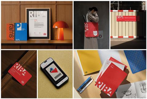
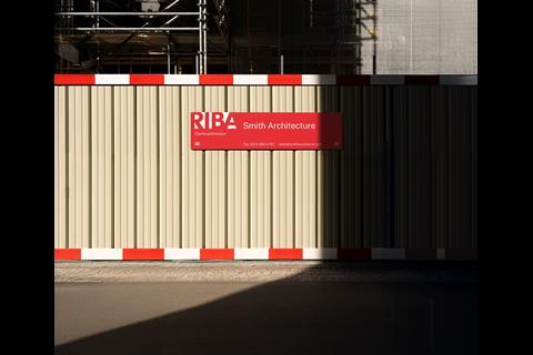
The RIBA has previewed its new brand identity, created with design consultancy Johnson Banks, as part of a wider programme of organisational change.
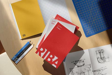
The rebrand will include a new logo, colour scheme and narrative, which the institute says is intended to reflect its role in advancing architecture and building a global community of architects.
The new identity is due to be implemented across RIBA and its brands in the coming months, beginning with the launch of a redesigned digital platform, RIBA.org, later this month. This sits within the organisation’s ongoing House of Architecture initiative, which also includes upgrades to its digital infrastructure, increased access to its collections and refurbishment of its Portland Place headquarters.
RIBA president Chris Williamson said: “The rebrand will be more than just a new look; it will be a powerful statement of our intent as an outward-looking, purposeful cultural institute. RIBA must remain relevant and essential to architects and practices across the globe, grow its membership among those early in their careers, and advocate on behalf of its members.”

Jack Pringle, chair of RIBA’s board, said: “It’s been over a quarter of a century since RIBA last considered its brand, with its 200th birthday approaching in 2034 it’s the perfect time to position our brand for the future. It’s vital that we modernise and adapt to the ever-evolving digital world and be fit for the 21st century. The upcoming rebrand is bold, creative and in-step with the digital world, marking a significant step forward for RIBA and our wider House of Architecture programme.”
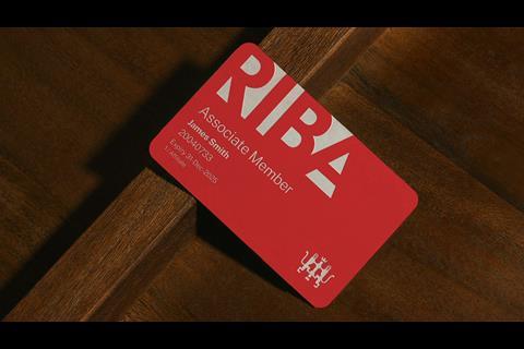
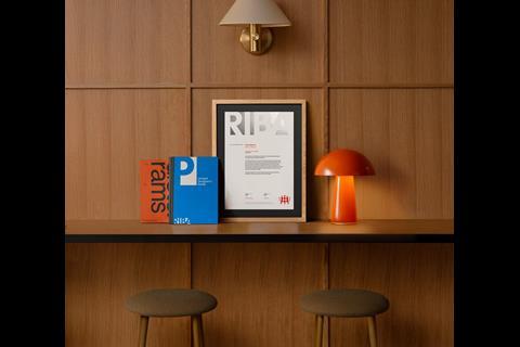
According to RIBA, the design is inspired by architectural spaces and connections, creating a bold typographic mark. Its historic red colour has been reinstated, while the organisation’s crest has been retained in a revised form.
Michael Johnson, creative director and founder of Johnson Banks, said: “Rebranding an esteemed organisation such as RIBA has to be done with great care - ensuring it remains relevant and resonant in a changing world, while also acknowledging and respecting its history. That’s why we’ve brought key assets – like its famous red – to the forefront and retained the historic crest. But it needed a more modern brand, and clearer voice – and that’s expressed in its new narrative and a bold new logotype that puts the RIBA name front and centre.”
Johnson added: “We’ve admired RIBA, from afar, for decades. This has been a once-in-a-lifetime opportunity to build on a world-famous organisation’s strengths, whilst modernising its verbal and visual brand as it gears up for its bicentenary.”
>> Also read: As his RIBA presidency ends, Muyiwa Oki reflects on milestones and unfinished business


5 Readers' comments