


When it comes to interior design for a residential scheme, an office or a public space, colour can be a powerful tool, helping people to navigate more easily - especially those with visual impairments. Our latest CPD, sponsored by Dulux Trade, explores why colour is important when it comes to designing for inclusivity and meeting the requirements of the Equality Act
CPD CREDITS: 60 MINUTES
DEADLINE: 1 JUNE 2018
For more information about Assemble Media Group’s CPD distance-learning programme, click here

![]()
INTRODUCTION
Colour choice is important to all users but especially those with reduced vision. It really can make or break how people access, use and enjoy a space, and for those with sight loss, making the most of limited vision through considered colour design and specification is most certainly one vital design outcome a building’s occupants will judge.
For the visually impaired, it’s more than just subjective. It affects how successfully a person navigates a building – corridors, doorways, stairways or simply moving from one room to another, all present challenges. However, clever colour scheming can make a real difference. Confidence can be improved and independence increased.
When real design skill is applied, an environment can be created that meets the needs of visually impaired people, whilst also retaining an attractive aesthetic.
Why colour and contrast are so important
Sight is our most important sense - three-quarters of information about our environment is received through vision. Yet there are more than 80 different types of eye disease and about two million people in the UK living with some form of visual impairment. And with the UK population ageing, the number of people with sight problems in the UK is set to increase dramatically over the next 25 years.
For these reasons, understanding how occupants will use a space and the powerful impact colour design choices have on a building’s success, are becoming even more important in the interior design process.
When choosing colours, it is always advisable to compare them side-by-side on the same background. As what we perceive as colour depends on many different factors. These include light, contrast, surface texture and subjective considerations.
For example, of those who are registered blind in the UK, 96% are able to detect some light. So, it is vital to make the most of contrast and lighting design to enhance people’s spatial awareness and help them use their residual vision to navigate buildings.
When entering a space, most people look around to understand the area they have entered. People with good vision usually do this instantly. Visually impaired people, however, often pause to gather information about the space or adjust to changing luminance. They often first try to discern the visual contrast at the wall or ceiling junction, usually the least cluttered area of a room, to establish a change of surface area or feature. When they start to move they concentrate their vision downwards, within 2m, and scan the area in front of them for contrasts between features.
Therefore an obvious response, to those with limited colour knowledge, might be to maximise colour and contrast between different objects using for example black, white and yellow – as in the photograph below. However, this results in an environment that is unacceptable to an interior designer - and also unappealing to the fully sighted user of the building.
Appealing interiors - colour design for visually impaired people
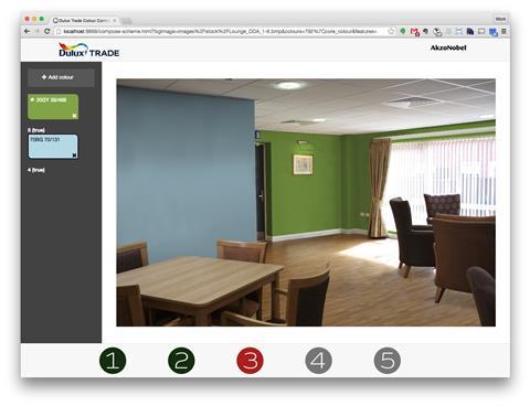
Dulux Trade has conducted research with the RNIB, Guide Dogs for the Blind and Reading University to look into ways in which colour can help visually impaired people to navigate a building as easily as possible.
The research established that over 80% of visually impaired people are able to distinguish colour differences, and that more subtle contrasts can be used as long as consideration is given to factors such as the illuminance and, crucially, where the contrast is used.
This makes movement much easier; assisting people with low vision to use an environment safely, and wherever possible, independently without creating environments that are unacceptable to fully sighted people, compromise design, or restrict design creativity.
Apart from allowing more flexibility for design, it also led to the development of visual contrast design guidance, identified in the following building legislation.
Designing for the Equality Act - regulation or restriction?
The Equality Act came into force on 1 October 2010, harmonising existing provisions into a single streamlined framework of equalities legislation, and replacing the earlier Disability Discrimination Act (DDA) 1995. The Equality Act requires that due regard must be given to any specific needs of likely building users that might be reasonably met. The minimum requirements to ensure that a broad range of people are able to access and use facilities within buildings were built into the Building Standards Part M (BS8300).
Part M stipulates a minimum difference in light reflectance value (LRV) between two adjoining surfaces of 30 points for new-build and major refurbishment projects; Building Standards Part M (BS8300) says this is best practice for all buildings.
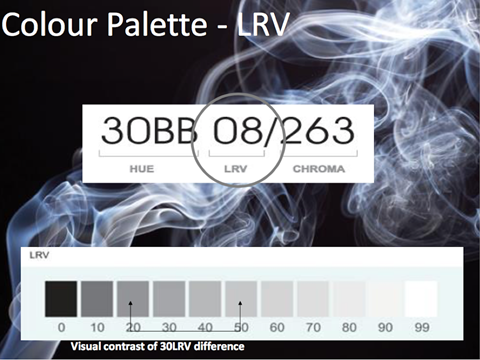
The LRV is a 100-point scale that expresses the percentage of light reflected from a surface, where 0 is black and 100 is white. Light reflectance is deemed more important than hue in visual contrast because many visually impaired people find it difficult to distinguish between surfaces of a different hue.
Providing visual contrast is not prescribed by law, but a building is unlikely to be signed off by building control if it does not adhere to the relevant regulations. Also, Building Standards Part M (BS8300) only advise on levels of visual contrast, not on how colour schemes are put together.
Achieving colour and contrast successfully
Light reflectance is just one of three aspects of colour as perceived by the eye. Notation schemes such as the Dulux Trade Colour Palette can also inform effective colour scheming in line with Building Standards Part M (BS8300), taking into account other aspects such as chroma and hue.
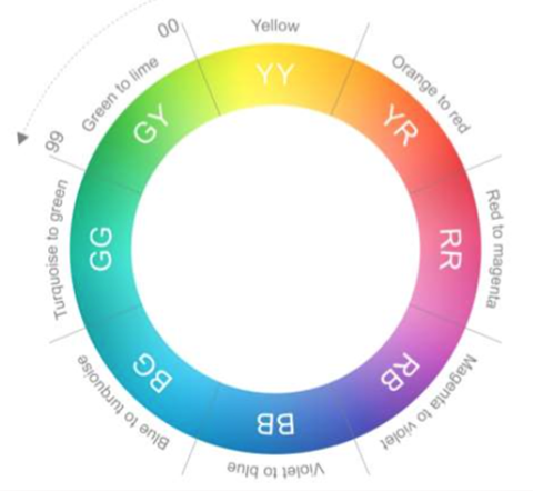
- Hue - this is the colour family; within each hue there is a scale from 00-99 indicating the colour’s position within the hue on the colour wheel (see figure below).
- Chroma - this is the intensity of the colour. A three-digit number on a scale of 000-999 represents the level of colour saturation. The higher the number, the more intense the colour, but the maximum chroma also depends on the hue – for example, yellow has a very high maximum chroma, whereas for blue the maximum chroma is much lower.
Notation schemes demonstrate that, by adjusting the hue or chroma, complementary schemes can be created that still provide an LRV contrast of at least 30 points.
Key colour scheming routes include:
Tonal
This is effectively using lighter and darker shades of the same colour. Tonal schemes are often simple and classic.
Harmonising
A harmonious scheme involves two or more colours that sit next to each other on the artist’s colour wheel. Harmonious schemes tend to be interesting and versatile.
Contrasting
A contrasting scheme uses colours that are opposite each other on the artist’s colour wheel. Contrasting schemes create a dramatic and exciting look.
Creating colour contrast for critical surfaces
Key areas where designers need to create colour contrast are critical surfaces – for visually impaired people, these are the most important elements, when surveying a room, gathering information and understanding a space in terms of its dimensions and size.
These surfaces include doors, skirting, general obstacles and furniture, and lighting.
Doors
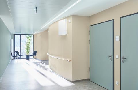
Wherever possible, the whole door and architrave should contrast visually with the surrounding surfaces.
The leading edge of the door should contrast with the wall in which it is opened, while the rest of the door, handles and finger plates should be sufficiently different in colour to the door. However, doors used for specific purposes that are not important for people to identify, for example, doors to maintenance areas or restricted working areas, can be in a similar colour to the adjoining wall.
Skirting
Identifying the junction of the wall and floor is important to visually impaired people when moving around, and both the depth of the skirting and its visual contrast with the wall or floor can influence their decisions.
For example, if a skirting board is the same colour as the wall, visual contrast will be seen between the bottom of the skirting and the floor. This will give an accurate indication of the size of the floor. However, if it is in a colour similar to the floor, the focus will be on the top of the skirting and the wall, making the space appear wider than it actually is.
For shallow skirting (100mm deep or less) this will not usually be critical, but for deeper skirting it can have a major impact on the safety of visually impaired people in smaller rooms or corridors, and on their confidence.
Designers should also avoid skirting in colours that lie between those of the wall and the floor.
General obstacles and furniture
Obstacles like radiators are dangerous and should a visually impaired person not notice them, may burn themselves.
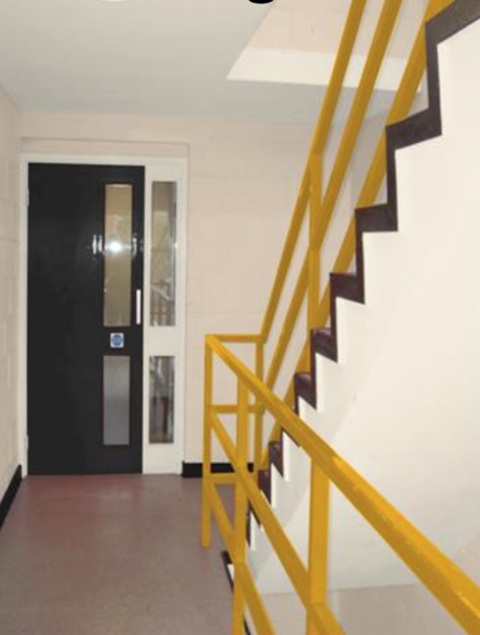
Other obstacles such as stairs should be considered with stair nosings in a single solid colour, which contrasts with the colour of the stairs. Likewise the handrail colour should be sufficiently different from the supporting wall colour.
Lighting
Poor lighting can also affect colour and contrast and defeat the object of creating a suitable scheme in the first place. In many interiors, lighting conditions can produce glare and shadows, which might add interest to a space, but can also create an environment in which visually impaired people feel uncomfortable. The recommended general minimum luminance at ground level is 100 lux.
How to create compliant colour schemes
To help specifiers maximise the inclusivity and usability of a space, by creating colour schemes that are both aesthetically pleasing and also comply with the visual contrast guidelines set out in the Equality Act Approved Document to part M (ADM) there use manufacturer tools like the Dulux Trade Colour and Contrast Design Guide.
This tool uses colour and contrast to maximum effect and can enhance spatial awareness and navigation, particularly for those with visual impairments, aiding in the identification of key building features and contributing to safety.
Getting the best outcome for the space beyond colour
Whilst colour and contrast are important for creating a successful scheme for people with low vision, there are other considerations for specifying paints that can have a lasting impact on an environment’s performance and the level to which it has to be maintained.
Maximise durability and performance
Some products can last longer due to their superior toughness and scrubbabiity. This can often extend maintenance cycles. These products are recommended for buildings that experience high levels of traffic or require regular, rigorous cleaning.
Additionally, paint containing mould-resistant fungicide is ideal for areas susceptible to getting wet, such as bathrooms, and actively inhibiting the growth of mould and reducing future maintenance outlay.
A sustainable approach to paint specification
A paint’s sustainability, from the way it is produced, how much is needed, and how it functions once it is applied, is another key consideration for specifiers.
To minimise the environmental impact, consideration should be given to paint products that have lower Volatile Organic Compounds (VOCs) and embodied carbon. This improves indoor air quality, reduces odour and allow occupants to move in quicker. Therefore low-VOC products such as water-based paints should be considered over high-VOC products such as solvent-based paints.
With the latest advancements in formulating technologies, manufacturers now strongly recommend that water-based paints are used for trim areas such as doors, skirting and window frames wherever possible.
Also, from an environmental compliance perspective, looking to select paint in line with BREEAM, SKA Rating or even the WELL Building Standard™ can be advantageous.
Choosing a product with a higher spreading rate without compromising on opacity will mean it goes further. Consequently, products that require fewer coats or have a greater spreading rate enable less raw materials to be used and therefore resources to be used per m2.
Added protective and preventative benefits
Specifying for certain areas, for example corridors and escape routes in social housing, will involve a duty of care when it comes to fire resistance. Flame retardant upgrade paints can be applied over existing painted walls and ceilings to slow the rate at which flames spread and reduce flashover.
For healthcare environments, coatings that contain an in-film bactericide, which inhibits bacteria and reduces populations of MRSA and E. coli, would be beneficial. These are available in a wide range of colours, enabling a scheme that meets both functional and aesthetic requirements.

How to take this module
Assemble Media Group’s CPD distance-learning programme is open to anyone seeking to develop their knowledge and skills. Each module also offers members of professional institutions an opportunity to earn between 30 and 90 minutes of credits towards their annual CPD requirement.
This article is accredited by the CPD Certification Service. To earn CPD credits, read the article and then click the link below to complete your details and answer the questions. You will receive your results instantly, and if all the questions are correctly answered, you will be able to download your CPD certificate straight away.
CPD CREDITS: 60 MINUTES
DEADLINE: 1 JUNE 2018
Privacy policy
Information you supply to Assemble Media Group Limited may be used for publication and also to provide you with information about our products or services in the form of direct marketing by email, telephone, fax or post. Information may also be made available to third parties. Assemble Media Group Limited may send updates about Building CPD and other relevant Assemble Media Group Limited products and services. By providing your email address you consent to being contacted by email by Assemble Media Group Limited or other third parties. If at any time you no longer wish to receive anything from Assemble Media Group Limited or to have your data made available to third parties, contact the Data Protection Coordinator at building@building.co.uk. View our full privacy policy at www.building.co.uk/cpd


No comments yet