


Ben Flatman explores the remodelling of the Sainsbury Wing and asks what is lost when a celebrated postmodern building is updated to make it more welcoming and accessible
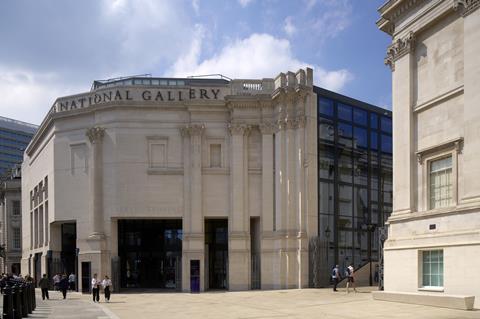
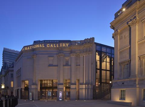
As the National Gallery approached the bicentenary of its foundation, it embarked on a major renewal programme known as NG200. The project was intended to reframe the institution’s presence in the public life of London and to broaden its appeal to a wider audience. The remodelling of the Sainsbury Wing, now to become the primary entrance for all visitors, is the most visible element of this first phase.
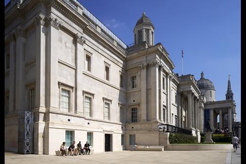
Designed by Venturi Scott Brown and opened in 1991, the wing has now been substantially altered by Selldorf Architects, working with Purcell as heritage architect. Vogt led the landscape design and Lawson Ward Studio delivered a reimagined learning centre at the back of the gallery on Orange Street.
This first phase also includes preparatory works for a second stage of development, due to start in 2026. That will introduce a new underground public link beneath Jubilee Walk, connecting the Sainsbury Wing with the original Wilkins building and a much improved research centre.
But this is not just another high-profile museum refurbishment. It also asks what it means to conserve postmodern architecture whose value lies as much in spatial sequencing and conceptual intent as in its built fabric. The new design opens up the building and improves the visitor experience. But does this greater clarity and rationality come at the cost of losing what made the original design distinctive?
Reworking a postmodern icon
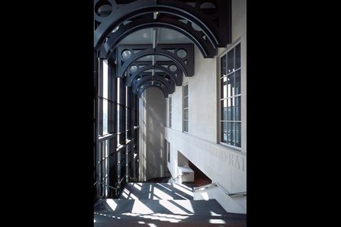
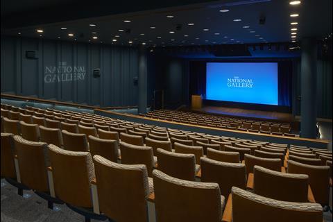
The Sainsbury Wing was conceived to provide new galleries for early Renaissance painting as well as a shop, restaurant, lecture theatre, seminar rooms and temporary exhibition space – ie a lot squeezed into a relatively small space. The interiors of the upper galleries – left essentially untocuhed bar a rehang – have always been widely praised, but the route into and through the building was more divisive.
National Gallery director Sir Gabriele Finaldi was appointed in 2015 and was soon struck by what he perceived as a poor arrival experience across the entire gallery. “We tried various experiments, shifting entrance doors from one end of the building to the other,” he explains. “Eventually, we settled on the Sainsbury Wing.”
The wing had not originally been designed as the primary entrance to the gallery, so an international design competition was held for NG200 during the pandemic. It was a closely watched process, with a shortlist that included David Chipperfield Architects, Caruso St John and Witherford Watson Mann.
The appointment of New York-based Selldorf Architects attracted attention, particularly given the travel restrictions at the time and concerns that practice principal Annabelle Selldorf would struggle to be present. In the event these worries proved unfounded, with Selldorf – just like the original US architects decades ago – visiting London regularly throughout the design process.
But Selldorf was never working alone, having invited Purcell to join their competition team. And while Selldorf led the design, for the purposes of delivery, Selldorf and Lawson Ward Studio were both subcontracted to Purcell, who held the architectural contract with the National Gallery.
The urgency of the programme was shaped by the bicentenary deadline. To meet it, the gallery opted for a construction management contract, appointing Sir Robert McAlpine. As Alasdair Travers, design partner at Purcell, explains: “We had an immovable programme with the bicentenary celebrations, and it was very brief.”
The contract structure allowed early enabling works to begin on site while detailed design packages were still being finalised.
Design approach: clarity, not parody
From the outset, Selldorf Architects and Purcell agreed they would not attempt a postmodern pastiche. As Jon Wright, heritage consultant at Purcell, explains, “There was a conscious decision not to go toe to toe with the pomo or play any kind of games with it. That way lies madness. You would end up tying yourself in knots trying to justify why you put this here or put that there.”
Instead, they adopted a clear, restrained approach rooted in understanding of the original design intent and a clear-eyed focus on the client’s brief.
Much of that understanding came through direct engagement with Denise Scott Brown, now aged 93. Wright travelled to Philadelphia to meet her and visited key works including the Vanna Venturi House and Woo Hall at Princeton.
“She didn’t give me an easy ride,” he recalled. “But we got a kind of rapport going. I did a lot of listening, which is really important because she’s got a lot of interesting things to say – not just about the project, but about architectural philosophy generally”.
Scott Brown’s thinking shaped key aspects of the scheme. “Her interests were in flow, the quality of the urban street, and how people move through spaces and what they do when they get there. She was interested in behaviour,” Wright said.
The conversations influenced how the revised design addressed the arrival sequence and how people orient themselves once inside.
For Wright, the comparison with Woo Hall at Princeton was instructive. “There are lots of similar kind of moves – the doors, the routes through,” he said.
Having visited Woo Hall myself in 2022, I was struck by how carefully it choreographs arrival, compression and release. That same concern with transition was present in the original Sainsbury Wing, where the compressed foyer gave way to the grand stair and the light-filled galleries above.
>> Also read: Building study: Learning from Denise Scott Brown
>> Also read: Denise Scott Brown rips into Selldorf’s National Gallery plans
Yet, in adapting the building to serve as the primary entrance to the gallery, some of that sequencing has inevitably been altered. The clarity of the new layout responds to contemporary needs.
But the question lingers: can a building designed to challenge architectural conventions survive conventionalisation? Or does rational clarity risk flattening spatial experience into something more generic?
Tensions remained between Scott Brown and Selldorf. “She’s making our building look like a circus clown,” Scott Brown said in a 2022 Observer interview. “There are elements of tragedy – circus clowns are made up to look happy, but they’re not. This is a circus clown wearing a tutu.”
Key changes: openness and edited drama
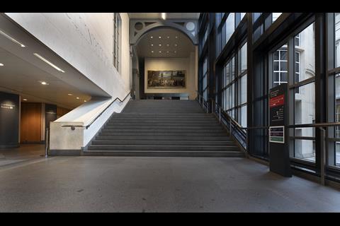
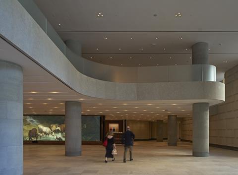
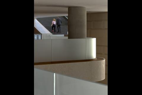
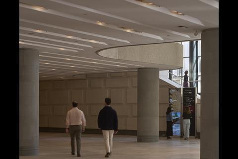
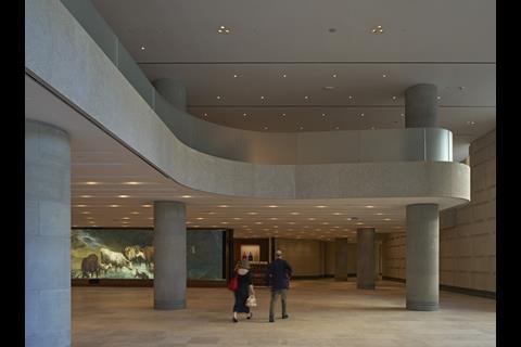
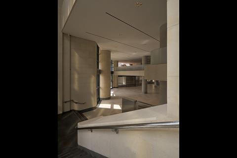
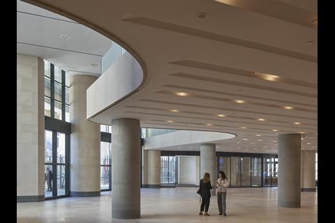
The most visible transformation to the Sainsbury Wing is the removal of three sections of the first-floor slab to create new double-height volumes at ground level. These cutaways replace what was once a compressed ground-floor space with one that is open, legible and more generous. They visually and spatially connect the ground floor to the level above. “You can see up, and people up there can see down,” says Travers.
Selldorf underlines the significance of the move, noting that she had assumed the first floor was a mezzanine, “only to discover that it wasn’t, it wasn’t at all.” The reconfigured floorplate now behaves more like one. Selldorf describes the result as creating a new “visual connectivity”, adding that “in one fell swoop, the trip up to the galleries is so much more dynamic and so much more exciting”.
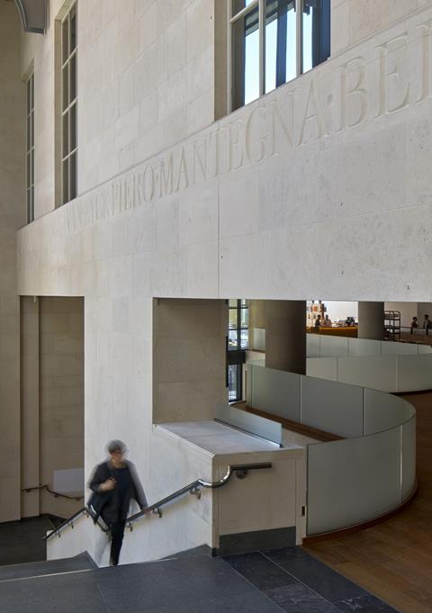
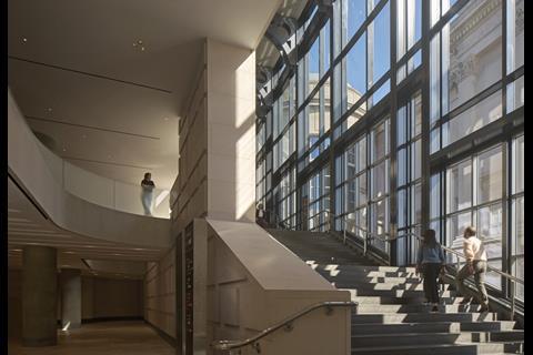
The grand staircase remains, but the effect of ascending it has changed. It no longer serves as an abrupt release from a dimly lit foyer. Instead, it rises from a space that is double-height and open. It still reads as a ceremonial route, but is more integrated into the foyer now.
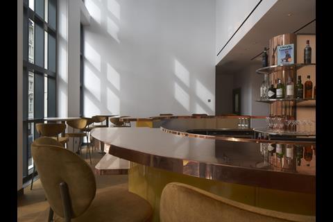
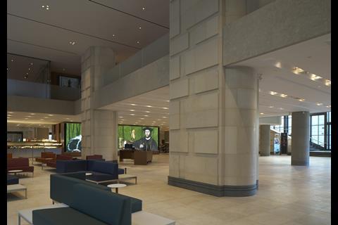
The mezzanine level has also undergone a major reworking. The bar and restaurant have been reconfigured to improve their functionality and presence within the building. By removing sections of the first-floor slab and opening views through the space, a stronger visual connectivity has been introduced.
As Travers explains, the intention was to create “both the draw at the end but also something visible from outside”. The changes allow daylight and sightlines to penetrate deeper into the plan.
From the street and the entrance level, visitors can now glimpse activity above. From within the restaurant, framed views connect diners with the city outside.
However, not all of the problems have been resolved. A frosted glass balustrade runs along the mezzanine edge, blocking views down to the entrance space for seated diners and limiting the visual connection from below. The bar and restaurant remain partially hidden and, for first-time visitors, their existence may still be unclear. It is a solution that slightly blunts the effectiveness of the stated intervention.
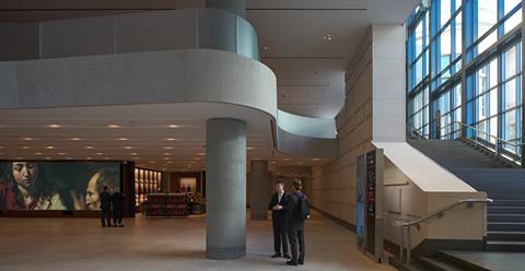
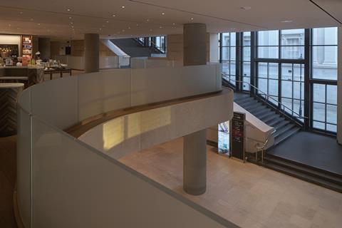
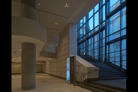
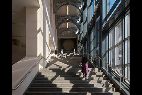
Changes to the windows support this broader aim. The original tinted glazing has been replaced with clear glass, allowing more daylight into the foyer and creating a visual connection with Trafalgar Square. The entry vestibule has been enlarged and reorganised, and the previous bag-check process replaced with security scanners.
As Travers observes, the interior of the foyer “now feels very light … you can see all the way through the building and out the other side.”
Overall there is more space and clarity now, but perhaps also less intrigue. The building is more generous and navigable, certainly, but less elusive, and perhaps less memorable too.
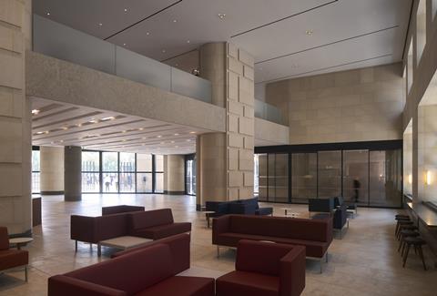
Other interventions contribute to this opening up of the space. Two large non-structural columns – famously opposed by original donor John Sainsbury – that once dominated the foyer have been carefully removed and repositioned to the west. A cloakroom has also been relocated to the basement. Selldorf notes that the changes together have increased publicly accessible floor area on the ground floor by around 60%.
Materially, the approach is one of continuity rather than contrast. Slimmed down columns are clad in Pietra Serena limestone, connecting with the galleries above. Other materials, including Chamesson limestone, Gascoigne blue limestone and rift-sawn oak, extend the building’s muted palette.
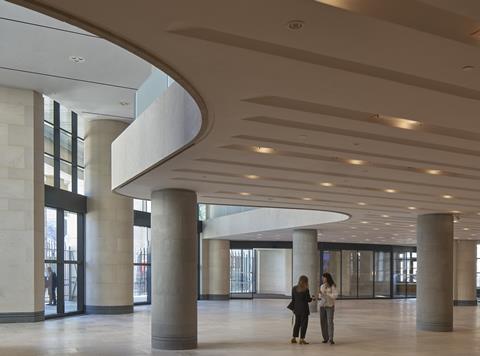
Lighting has been significantly improved. The strip-lit ceiling has been replaced by a suspended array of handmade Murano glass plate diffusers, producing a softer and more tactile quality of light.
“I think we felt before that the lighting always felt slightly hard,” says Travers. “We wanted to bring in things which would give the human quality – a bit of texture and warmth.”
Selldorf is clear that the changes are substantial. “But it’s not an egotistical journey,” she says.
“We have all worked together and we checked with one another about whether these arguments that we put forth were standing on two feet. And I feel we came out at the other end knowing that we did things with reasoning.”
She stresses that the interventions were grounded in empathy rather than imitation: “We kept the materials very, very simple … we wanted to show that the structure is something that goes through the building.”
The use of stone and light, she adds, aimed to create “a general sense of logic … both connected to what was there already, but also to what we were talking about”.
Whether that rather modernist reasoning will convince those who valued the building’s original postmodernist ambiguity is less certain. What is clear is that Selldorf and her collaborators have delivered a confident and coherent response to a demanding brief.
Landscape and external realm
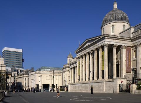
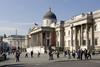
Outside, a less dramatic transformation has taken place. The landscape design by Vogt has turned what was a barely perceptible courtyard into a generous new public space. This subtle intervention delivers new public realm that reinforces the Sainsbury Wing as the gallery’s new front door. It also helps to rationalise the arrival experience of visitors from Trafalgar Square, while enhancing the setting of the building itself.
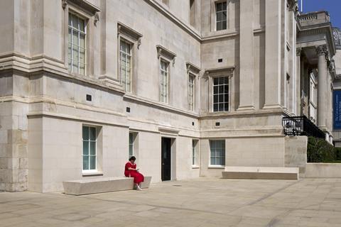
There is no formal plaza, no grand new sculpture. Just levelled terrain, reused materials (in two elegant benches) and a clear sequence that guides people towards the entrance. It is an enabling space rather than a dramatic urban statement.
The Learning Centre: a contrasting playfulness
Tucked away on Orange Street, the National Gallery’s refurbished Learning Centre offers a spirited counterpoint to the Selldorf and Purcell scheme. Designed by Lawson Ward Studio, this is a space pitched at younger visitors, school groups, adult learners and families, and its design reflects that inclusive brief.
Unlike the reworked Sainsbury Wing, the language here embraces a certain postmodern exuberance. A three-dimensional screen as you enter picks out architectural references from 12 paintings within the gallery’s collection, including the famous depiction of Saint Jerome in His Study by Antonello da Messina.
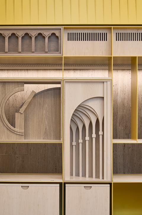
Hannah Lawson says: “We kind of did [embrace postmodernism]. And I think it wasn’t intentional. We just wanted the collection to be really present and to resonate, and we found that, through these architectural motifs, the children were really engaging … They were very visible and tangible and understandable … They sort of transcend generations.”
She recalls that the original interiors were “very corporate … people would come in and say, ‘is it a bank? Is it council offices?’ ”
The transformation is dramatic. A large new window now reveals creative activity to passers-by, while internal spaces are open, light-filled and highly flexible. “We wanted people to know this is a place for making,” she explains.
The changes are more than aesthetic. The building now supports hybrid learning, late-night events and high volumes of visiting school groups. While it shares the NG200 programme’s broader goals of welcome and accessibility, its architectural tone is deliberately distinct.
What’s been lost: complexity traded for clarity
The remodelling of the Sainsbury Wing has unquestionably made the building easier to use. It is now more open, more accessible, and more welcoming. But in achieving these goals, it has also forfeited some of its original complexity and charge. The dynamic of the original Venturi Scott Brown’s architectural power came not from harmony, but from tension.

That tension has been softened. The original entrance sequence, which offered deliberate compression before release, a kind of spatial theatre, has been dissolved. The “mezzanine” is now actually a genuinely one, but the compression that once set up the drama of the stair has gone.
The curved slab cutaways above serve their spatial purpose, but lack a clear formal justification. A digital screen displaying high resolution details of the gallery’s collection now animates the foyer’s rear wall, yet arguably feels as commonplace as those found in corporate lobbies.
The overall feel of the building is different. It works better – but it also feels less like itself.
Successful and yet strangely anonymous
By almost every practical measure, this is a successful remodelling. The Sainsbury Wing is now a clearer, more public-facing threshold to the National Gallery. “One of the things I was very concerned about was the welcome that we provided for visitors,” says director Gabriele Finaldi. Functionally, nearly all his aspirations have been met.
The design team have approached the project with care and seriousness. The building’s grade I listing and the intensity of feeling surrounding it demanded nothing less. Annabelle Selldorf repeatedly emphasised her admiration for the original, describing her intention as helping to transform it into “a place where you gathered, you rested, and then you went on your way – and, significantly, there was the indication of where you were going: you were going toward art.”
But admiration and transformation do not always sit comfortably together. In making the building easier to enter and use, it has been stripped of its most radical public gesture, its deliberate complexity. As listed postmodern buildings come under increasing pressure to adapt, the question remains: can clarity and contradiction ever truly coexist?
>> Also read: Jamie Fobert Architects and Purcell’s National Portrait Gallery refurbishment
>> Also read: ‘Would you rather be sold religion or soap?’: Venturi and Scott Brown’s story
Project team:
Design Architect: Selldorf Architects
Heritage Architect: Purcell
Learning Centre Architect: Lawson Ward Studio
Landscape Design: Vogt
Architectural Competition: Malcolm Reading Consultants
Client Project Management: The NG200 Project
Project Manager and Cost Consultant: Gardiner & Theobald
Construction Manager: Sir Robert McAlpine with Blue Sky Building
Structural Engineers: Arup
Services Engineers: Arup
Sustainability Engineers: Arup
Pedestrian Flow: Arup
Acoustic Engineers: Arup
Lighting Consultant: L’Observatoire International
Planning Consultant: The Planning Lab
Access Consultant: David Bonnett Associates
Community Engagement: Kaizen
Access consultant: Jane Simpson Access
Fire Engineers: OFR Consultants
Downloads
01 NG200_Site Plan
PDF, Size 0.7 mb02 NG200_Ground Plan
PDF, Size 0.42 mb03 NG200_Mezzanine Plan
PDF, Size 0.55 mb04 NG200_Theatre Level Plan
PDF, Size 0.21 mb05 NG200_Section A
PDF, Size 0.55 mb06 NG200_Section B
PDF, Size 1.22 mb07 NG200_Section C
PDF, Size 1.54 mb


5 Readers' comments