


Jamie Fobert Architects has taken the Gherkin’s Konditor & Cook café to new heights with a hanging mezzanine ceiling
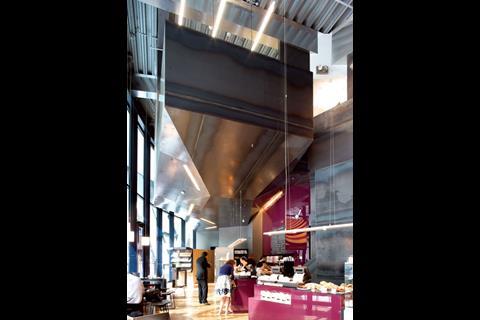
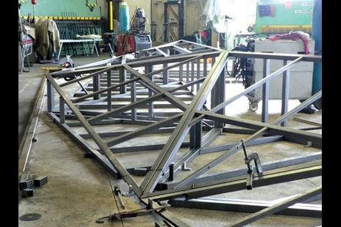
Ceilings, says architect Jamie Fobert, are the Cinderella of interiors. They’re the afterthought, the surface that gets left until the point when ideas and budget are both running out. But at the new Konditor & Cook shop and café at the base of Foster’s Gherkin, Jamie Fobert Architects has designed a memorable event of a ceiling. It’s a multi-faceted black steel box, an irregular intrusion into the double-height space, hanging in the air like an unanswered, unavoidable question.
In function, it’s a mezzanine floor, creating space for a kitchen where staff prepare every cake, tart and brownie sold in the shop below. Not that you’d guess that from the deliberately enigmatic form, its planes, angularity and shiny waxed surface making it inscrutable and mysterious. When Fobert discusses it, he reaches for another kind of fairy tale. “Remember the bit in the first Star Wars film, where you’re sitting in the cinema and the spaceship comes overhead from behind you? That’s what it is!”
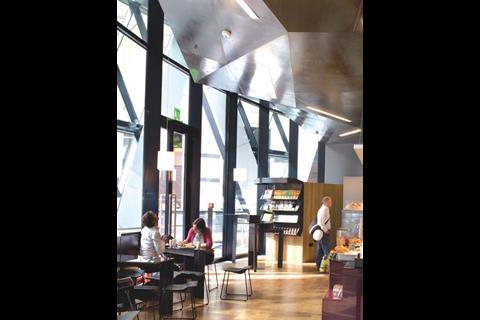
The sci-fi ceiling is also a robust response to the curves of the Gherkin, as is Fobert’s interior as a whole — a strong composition of simple shapes, ideas and colours, holding true to the chef’s maxim that a few fine ingredients make more impact than several fussy ones. And a key ingredient is Foster’s space itself, left in all its double-height expansiveness next to the entrance. “The most important thing was the play between what’s inserted into the building and the building itself,” says Fobert.
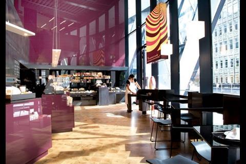
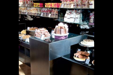
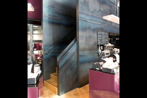
The rear wall is clad in more black steel, and includes another example of strong shape-making in an access staircase so cleverly folded into the surface that it only reveals itself as you walk around the curved floorplate. The same material — in thicker plates with a more obvious surface patina — is used for the display surfaces and glass-topped café tables, their stiffness and angularity picking up the ceiling’s cues. They are also aligned in a strong diagonal that leads customers into the shop, again working in contrast to the curved facade.
A few fine ingredients make more impact than several fussy ones
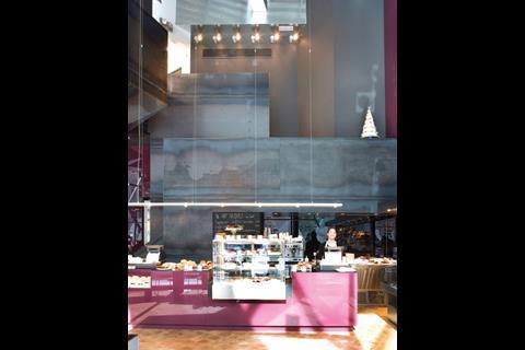
On the right of the main entrance, the 8m-high end wall is covered in back-painted glass in the patisserie’s brand colour of imperial purple, its glossy surface providing reflections and depth, the division into panels providing scale and interest. Purple also reappears behind the main servery area, and in the washroom walls. The relatively dark palette is made possible by the daylighting from the 8m-high glazed walls, and the contrast of the light, bright, end-grain oak flooring — actually a laminated board.
The other key ingredient, Konditor & Cook’s delicious cakes and savouries, are displayed on custom-made black steel display units, and off-the-shelf refrigerator cabinets selected for their four-square shape and unfussy styling. The overall effect is a sensory richness that matches the indulgence of the cakes, balanced by a rawness and strictness.
London’s Konditor & Cook chain of patisseries is a delicious open secret, low on marketing and high on word-of-mouth recommendation. Founder Gerhard Jenne already had four outlets in central London when he found the vacant double-height shop unit at the Gherkin. But before signing the lease, he invited Fobert, whom he already knew from his interiors for Aveda, to view the space and see if it was a challenge that would interest him. “I wanted continuity with the previous shops, but also something new,” says Jenne.
Adding a mezzanine was an obvious and necessary move to achieve enough floor space: for displaying the produce, a servery for takeaway hot dishes, café tables and chairs, as well as an on-site kitchen to cook, bake and decorate every piece of merchandise. The easier route the architect might have taken is visible in the bar next door — a curved gallery that spans close to the facade, leaving just enough margin for an open-tread staircase that completely interrupts the views through the window.
We didn’t want to deny the significance of the building, but wanted something that was essentially Konditor & Cook
Fobert’s mezzanine was his opportunity to stamp his own aesthetic on the building, without stamping all over the Stirling prizewinner. “We were trying to balance the deeply practical, absolutely functional aspects of the kitchen with developing a new aesthetic and an image,” he says. “We didn’t want to deny the significance of the building, but wanted something that was essentially Konditor & Cook.”
In the new ceiling, Foster and Fobert do complement each other well. Visible spot welds where the sheets were joined to the frame give it a handmade, human quality that fits with the USP of the product, but it also has a hi-tech feel to match the host building.
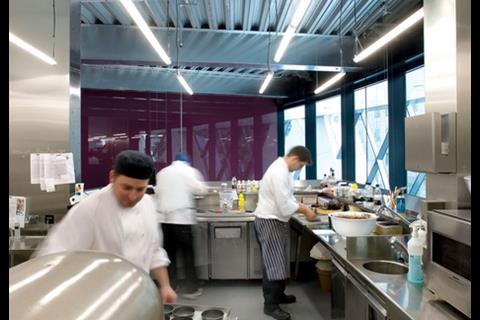
The upper floor contains preparation areas for sweet and savoury foods, serviced by a powerful extraction system. Catering staff often work in airless basements, and Fobert and Jenne are pleased to have created a first floor kitchen with natural daylight. There’s also an escape staircase tucked into the far end.
The shop-fitting aspect of the design has some clever touches. For most of the year, the shop operates with four till points. But during the Christmas and Easter rush, staff can use a fifth station in front of the entrance that spends most of its time concealed within the black steel display unit. Black steel is becoming a Fobert signature, also used in the mezzanine in his own office, and in the Upright Figure installation at Tate Modern. In each case, they’ve been crafted by Dave Seggie of Secure Metalwork.
As the nights get longer, Jenne is looking forward to the shop’s warm glow spilling outside
Inset shelves allow products to be displayed at different levels, creating more opportunities to catch the susceptible buyer’s eye. The café table nearest the entrance and a higher-level café table at the far end of the shop both double as extra display space if necessary. However, Jenne has doubts about the glass tops to the steel café tables. “I thought they were just steel — you can see every fingerprint,” he grimaces.
Konditor & Cook worked with graphic designers to devise a new brand identity for the chain, carried across its cake boxes and carrier bags. Red, yellow and purple all swirling together in a cake-mix motif is used colourfully on a large light box that makes the subliminal suggestion of a shopping bag while lighting the main display area.
Other light fittings are unusual, elegant and plentiful. “Architects tend to underlight shops,” asserts Fobert. As the nights get longer, Jenne is looking forward to the shop’s warm glow spilling outside into the surrounding plaza.
In designing interiors, Fobert says he is an architect first and foremost, and an “interior designer” only in so far as it’s an accurate geographical description of the project. That point is self-evident in an interior that’s all about space, shape-making and functionality rather than decoration.
“We like our shops to have an elemental quality,” the architect says. “We like the sense that the interiors have been around for a while.” The Konditor & Cook ceiling, certainly, is going to be legendary.
Downloads
Floor plans
Other, Size 0 kb
BD Magazine - September 2007
- 1
- 2
- 3
- 4
- 5
- 6
- 7
- 8
- 9
- 10
- 11
- 12
- 13
- 14
- 15
- 16
- 17
- 18
- 19
- 20
- 21
- 22
 Currently
reading
Currently
reading
Box of delights
- 24
- 25
- 26
- 27
- 28


No comments yet