- Home
- Events
Early bird tickets available now
Find out more
Events calendar
Explore now
Keep up to date
Find out more
- Programmes


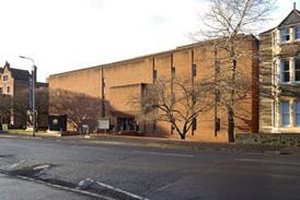

Building study: A new campus for the RCA by Herzog & de Meuron
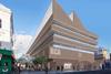
In its scale and singularity this flagship building by Herzog & de Meuron strikes the right balance, writes Richard Gatti
Designing a new art and design building for the Royal College of Art is a balancing act. On the one hand, the RCA is an outward facing institution, looking to showcase its facilities, students and their work – in part to attract the very best students of the future and to give its many funders (including the government) something to boast about. On the other hand, it is all about experimentation and safe spaces: trying out ideas, testing them until they break.
Successful studio spaces give their occupants licence – licence to screw things into the walls, paint the ceiling, take an angle grinder to the floor. Experimentation, and the inevitable failure that goes with taking risks, requires a degree of introversion, ownership and control, rather than picture windows to Battersea Bridge Road. Similarly destructive transformations of space are not obviously welcome activities in £135m flagship buildings.
This content is available to registered users | Already registered?Login here
You are not currently logged in.
To continue reading this story, sign up for free guest access
Existing Subscriber? LOGIN
REGISTER for free access on selected stories and sign up for email alerts. You get:
- Up to the minute architecture news from around the UK
- Breaking, daily and weekly e-newsletters
Subscribe to Building Design and you will benefit from:

- Unlimited news
- Reviews of the latest buildings from all corners of the world
- Technical studies
- Full access to all our online archives
- PLUS you will receive a digital copy of WA100 worth over £45
Subscribe now for unlimited access.