


Two domestic projects by Studio KAP, one at Dumgoyne near Glasgow, the other near Oban, share highly specific handling, and both captivate and intrigue, finds Charles Rattray
Studio KAP has been practising for only six years but it seems like much longer. It’s not just that it has produced a considerable body of fine work, it’s that so much of it has been published and given awards. In these projects the practice has appeared to relish certain things in particular. The building process itself is one (even if its love of the crafted detail must occasionally make the relationship masochistic); the qualities of a given site are another (one thinks of the bowling club at Balornock, horizontal as the green, or the recently completed football social club in Rutherglen with its appropriate urban toughness). But perhaps because most of its completed projects are small in scale, its architecture has been especially characterised by an expressive and intimate engagement with — even perhaps celebration of — its clients’ programme. Generic it isn’t.
The two projects featured here are cases in point, carefully considered and highly specific. The first is an extension to a long stone house at Dumgoyne, north of Glasgow; the second is a completely new house built on the seashore south of Oban on Scotland’s west coast.
Dumgoyne extension
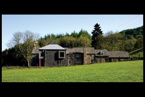
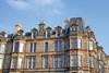
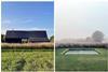
The form of the extension at Braefoot House is far from formulaic. Indeed, the view as you approach suggests that a small tower house has docked, slightly awkwardly, with the long, stepped form of a house. This formal inconsistency, this differentiation of the new, might seem deliberately fanciful, but the architect points to the way some vernacular buildings — such as the Glengoyne distillery, visible across the fields — typically make an assemblage of disparate forms. Certainly the result is memorable, like a toy-town grouping of blocks on the nursery floor.
Externally, any continuities between new and old are abstract. For example, the texture and tonal variation of the slate cladding on the new make an unexpected correspondence with the existing sandstone rubble. Similarly, one can argue that both parts of the combined building have their own different authenticity — one framed, slightly skewed and with varied cladding, the other solid, rectangular and with walls of one material. Notably, the visual independence of the new “box” prompts a reading of the existing building as a spine, and in turn allows one to speculate about the possibility of other quasi-autonomous boxes joining the group in due course. For the moment, however, one is enough.

Slate (as on the roof of the existing house), zinc, cedar and glass are the palette, generally handled in panels. Windows also puncture the slate and are neatly detailed with projecting timber frames when small, although on the west elevation the large zinc-clad oriel comes within a single slate’s width of a small window so that the metal is carried over, resulting in an awkward, hybrid composition.
One can argue that both parts of the building have their own authenticity.
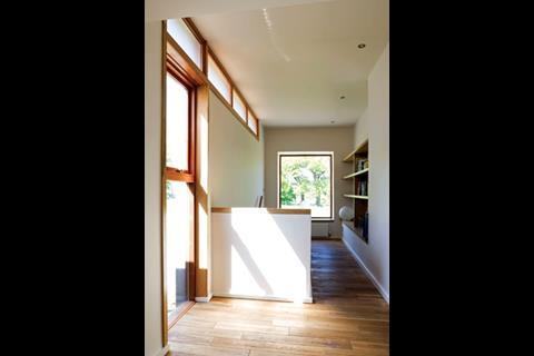
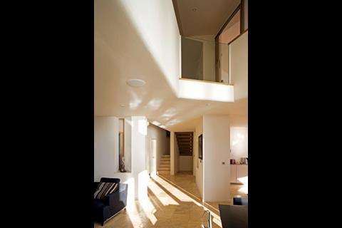
The interior is a considerable contrast to the exterior. As you enter the old building and move around the new utility core with its curved walls, the ground floor and ceiling levels continue seemlessly into the new box beyond. The blurring of this connection suggests an interest in the building as a single whole as opposed to a sum of the parts made so clear on the outside.
Things change with a jump in ceiling height of 500mm in part of the dining area. The move provides a more generous volume in the place with the best views (and has a terrace to prove it) but it has a price that becomes evident upstairs, where the main bedroom occupies the upper floor of the new and therefore has a correspondingly higher floor level than anything else around it. This awkwardness is compounded by what might be seen as the immoderate importance given to the bedroom by its considerable height under the trapezoidal roof and its rooflight crown. There is the lingering thought that the ground floor could have stepped down in pursuit of volume, rather the ceiling step up, a thought that remains as one sees the groundedness of the old building disappear towards the north of the extension in favour of the terrace which hovers above more marshy ground. Here it is the old building, with its thick walls and small openings, that allows the more direct access to the garden.
That irony prompts various readings of the composition engendered by its external forms. If one imagines the box here for a moment as a Scottish tower house or keep (and it is hard not to see links), then the lower building would be its later extension, part of a courtyard, for example. Then again, the rooms of such a keep would be arranged with the hall placed below the private chambers of the laird. And so on.
New-build in Arduaine
Curiously enough, one can apply similarly anachronistic logic to the new house Studio KAP has built by the seashore in Arduaine, Argyll — Tigh Na Dobhran. In one reading, we have a long shed with a monopitch roof that has acquired white rendered extensions. In another (and this is the architect’s conception), we have a lightweight box placed on a podium between solid masonry blocks or pavilions, as if the rendered masonry was there first — an inhabited ruin.
Either way, there is no doubt about the astonishing presence of the house in this part of the country, or about the picture postcard beauty of the place itself, where orange buoys bob in the sea loch with a concrete pier, a shingle shore and a salty tang. The house had to be constructed to cope with the sort of storm that occurs once in 500 years.
Organic shapes on plan result in an amazing volumetric drama.
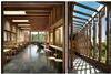
The shore and jetty to the west and south, the final seaward rush of a tree-lined burn to the north and a road to the east define the site. The front door is approached across a tended area between the rough pasture of the foreshore and a reinstated “natural” bank to the road, where native trees have been planted to continue the pattern of the ash, rowan and Scots pine to the north. These work well on the north elevation, where they screen the white rendered blocks in a manner reminiscent of the way you first see the outbuildings at Aalto’s summerhouse at Muuratsalo.

But that is at the back. The views to the south and west — to the sea — are the main thing here, and almost all windows orientate that way, though some pleasure is taken in focused views of grass and trees. The monopitch ends as a cantilever with a picture window to the postcard view. The remaining walls of this part are stainless steel, including the garage doors, and the roof is slate — precisely the opposite arrangement of metal and slate at the house extension at Dumgoyne, but there we are.
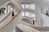
The interior is unpredictable. If the outside hinted at the architect’s preference for relationships between forms rather than for strong forms per se, then the inside completes the picture with a marked move towards the amorphic and organic. There are radiating lines and curves; walls are no longer parallel. Organic shapes on plan, reminiscent of Scharoun and certain projects of Siza, come together with voids, angles and level changes, and result in an interior with an amazing volumetric drama, unobscured even by the stairs to the upper floor, which are open tread.
Was it Colin Rowe who said: “I like walls, the thicker the better”? If so, he’d have liked it here, where the walls are contrived to appear very thick indeed, sculpted and with carved-out hollows like those in a castle. Suggestive, too, are the plastered gallery soffits, continued round into the upstands. The warm, off-white paint may be a nice contrast to the bleached white of the outside, but the cosiness of the house is more to do with the solidity its interior evokes, the predominance given to the hearth, and the way the main living room is understood in contrast to the “sea room” — as a place where you batten down the hatches and enjoy the intimacy of a lower ceiling and smaller windows.
Both these buildings raise questions about how they might be understood and, for that matter, how to understand them. If they do not offer easy answers, that is at least partly because they lie outside the normal architectural range. Studio KAP breaks rules by using more materials than are strictly necessary, by contriving inconsistencies and by seeming to encourage multiple interpretations of its output. In that sense, it is a latter-day mannerist. It reminds us of the orthodoxy — that architecture is essentially derived from use and context — then in its play with that orthodoxy, introduces a creative reflection on regionalism.
PROJECT TEAM (Dumgoyne)
Architect Studio KAP Architects
Structural engineer Woolgar Hunter
Main contractor Standard Construction
(ARDUAINE) Contractor Standard Construction,
Quantity surveyor BCC
Structural engineer David Narro Associates
Downloads
Braefoot House extension, Dumgoyne - Floor plans
Other, Size 0 kbTigh Na Dobhran, Arduaine - Floor plans
Other, Size 0 kb
Postscript
Charles Rattray is an architect. He teaches at Dundee University, is associate editor of Architectural Research Quarterly, and a co-author of Rationalist Traces (Wiley, 2007)
Photos by Keith Hunter
Original print headline ’Intimate details’

No comments yet