


Colour is a vital part of interior design but is subjective and hard to define. But for the visually impaired, colour and contrast can be critical to accessibility and are subject to strict regulations. This CPD module is sponsored by Dulux Trade
How to take this module
![]()
To take this module read the technical article below and click through to a multiple-choice questionnaire, once taken you will receive your results and if you successfully pass you will be issued automatically with a certificate to print for your records.
![]()
Colour selection is one of the most fundamental aspects of interior design. But colour is a complicated thing, not easy to describe in empirical terms. What we perceive as colour depends on many different factors. These include light, contrast, surface texture and subjective considerations.
- Light: We are all generally aware of this: colours do not look the same at dusk as in the midday sun, and look different in daylight or artificial light.
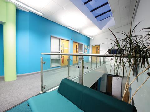
- Contrast: Our perception of colour changes depending on the background or other colours that are used around an object or coloured area.
- Surface texture: Materials can also define the perception of a colour. This is often due to the associations these materials evoke. Soft, matt, dry, textured or light materials, such as some woods and textiles, have a warm effect. Hard, shiny, wet or dark materials, and materials without texture, give a cool impression. Metal, glass, stone and some plastics are perceived as cold materials.
- Subjective factors: Some colours carry clear associations — for example, red is often used to indicate danger or emergency. But the psychological effects of different colours are not the same for everyone. Even if they are looking at the same object, people will draw on different references and experiences and describe the same colour in very different words. Visual impairment will also change perception from person to person, which this article will look at in more detail below.
It is also important to note that colour can also have an illusory effect. Contrast can be used to suggest a direction of movement or to create a sense of distance. In this way, the size of a room can be “corrected” — if it feels too big, deep colours such as red, orange or dusky yellow can be applied to make the walls seem to advance towards you; if it feels too small, lighter colours such as pale green, blue and off-whites can give the effect of walls
receding, making it seem larger than it actually is.
For all these reasons, colour often defies definition. Unlike weight or length, there is no universal scale to measure it. There are, however, various notation systems, including RAL — a German system used mainly in powder coating — the Natural Colour System, the Dulux Trade Colour Palette, and Pantone, which is used mainly in printing.
As this article will examine, ways of denoting colour contrast have become more important in recent years with the introduction of regulations on this aspect of buildings.
Importance of contrast
Sight is our most important sense — about three-quarters of information about our environment is received through vision. But there are more than 80 different types of eye disease and about 3 million people in the UK suffer some form of visual impairment. Of those who are registered blind in the UK, 96% are able to detect some light. It is vital to make the most of contrast and lighting design to enhance people’s spatial awareness and help them use their residual vision to navigate buildings.
When entering a space, most people look around to understand the area they have entered. People with good vision usually do this instantly. Visually impaired people, however, often pause to gather information about the space or adjust to changing luminance. They often first try to discern the visual contrast at the wall/ceiling junction, usually the least cluttered area of a room, to establish a change of surface area or feature. When they start to move they concentrate their vision downwards, within 2m, and scan the area in front of them for contrasts between features.
Critical areas
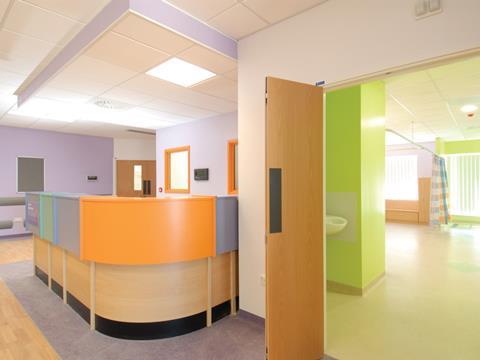
Key areas where designers need to create colour contrast include doors, skirting, general obstacles and furniture, and lighting.
Doors
Wherever possible, the whole door and architrave should contrast visually with the surrounding surfaces.
The leading edge of the door should contrast with the wall in which it is opened, while the rest of the door, handles and finger plates should be
sufficiently different in colour to the door. However, doors used for specific purposes that are not important for people to identify (for example, doors to maintenance areas or restricted working areas) can be in a similar colour to the adjoining wall.
Skirting
Identifying the junction of the wall and floor is important to visually impaired people when moving around, and both the depth of the skirting and its visual contrast with the wall or floor can influence their decisions.
For example, if a skirting board is the same colour as the wall, visual contrast will be seen between the bottom of the skirting and the floor. This will give an accurate indication of the size of the floor. However, if it is in a colour similar to the floor, the focus will be on the top of the skirting and the wall, making the space appear wider than it actually is.
For shallow skirting (100mm deep or less) this will not usually be critical, but for deeper skirting it can have a major impact on the safety of visually impaired people in smaller rooms or corridors, and on their confidence.
Skirtings in colours that lie between those of the wall and the floor should also be avoided by designers.
General obstacles and furniture
The number of items protruding into the walking space should be minimised. Those that are essential should be contrasted against floor and wall surfaces, and other backgrounds against which they may be viewed. This also applies to free-standing objects.
Lighting
Poor lighting can affect colour and contrast and defeat the object of creating a suitable scheme in the first place. In many interiors, lighting conditions can produce glare and shadows, which might add interest to a space, but can also create an environment in which visually impaired people feel uncomfortable. The recommended general minimum luminance at ground level is 100 lux.
It is important to note that different types of lighting have different effects on colour.
- Tungsten is a warm light that reflects back from warm colours but makes cool colours look dull.
- Halogen is the closest to natural daylight and both warm and cool colours remain “true”.
- Fluorescent makes cool colours appear brighter but warm colours absorb light and seem dull.
Regulations on contrast
The Equality Act came into force on 1 October 2010, streamlining previous anti-discrimination legislation. Guidelines relating to inclusive design in buildings within this are Part M of the Building Regulations and BS8300:2009.
Part M stipulates a minimum difference in light reflectance value (LRV) between two adjoining surfaces of 30 points for new-build and major refurbishment projects; BS8300:2009 says this is best practice for all buildings.
The LRV is a 100-point scale that expresses the percentage of light reflected from a surface, where 0 is black and 100 is white. Light reflectance is deemed more important than hue in visual contrast because many visually impaired people find it difficult to distinguish between surfaces of a different hue.
Providing visual contrast is not prescribed by law, but a building is unlikely to be signed off by building control if it does not adhere to the relevant regulations.
Regulation or restriction?
The emergence of regulation on visual contrast has led some designers to fear that they will be forced to create stark, even ugly, colour schemes, dependent on whites, blacks and striking intermediate colours such as yellows. But Part M and BS8300 only advise on levels of visual contrast, not on how colour schemes are put together.
Light reflectance is just one of three aspects of colour as perceived by the eye. Notation schemes such as the Dulux Trade Colour Palette identify the other aspects as chroma and hue.
Hue is the colour family and chroma is the intensity of the colour. Rich colours used to provide accent or drama are high chroma and have a low LRV; calm shades have a low chroma and low LRV; and fresh shades have a medium chroma and high LRV.
Notation schemes demonstrate that, by adjusting the hue or chroma, complementary schemes can be created that still provide an LRV contrast of at least 30 points.
To take this module read the technical article and click through to a multiple-choice questionnaire, once taken you will receive your results and if you successfully pass you will be issued automatically with a certificate to print for your records.
![]()
Company name: Dulux Trade
Website : www.duluxtrade.co.uk
Postscript
Privacy policy
Information you supply to UBM Information Ltd may be used for publication and also to provide you with information about our products or services in the form of direct marketing by email, telephone, fax or post. Information may also be made available to third parties. “UBM Information Ltd” may send updates about BD CPD and other relevant UBM products and services. By providing your email address you consent to being contacted by email by “UBM Information Ltd” or other third parties. If at any time you no longer wish to receive anything from UBM Information Ltd or to have your data made available to third parties, please write to the Data Protection Coordinator, UBM Information Ltd, FREEPOST LON 15637, Tonbridge, TN9 1BR, Freephone 0800 279 0357 or email ubmidpa@ubm.com.


1 Readers' comment